

Patterns in the data: a new way to explore what younger people with AFib are telling us
Zoom out far enough on the new Patterns page and the whole thing resolves into a single shape: a heart, made entirely out of hearts. That wasn’t a design choice I forced. It’s what happens naturally once you plot 128 real people from 15 countries by what they have in common. Each one shows up as a small heart of its own, sitting closest to the others who share its experience. Seeing them all together like that, forming one larger shape, is the clearest way I’ve found to say something I’ve believed since I started this project: none of us are managing this alone, even when it feels that way at three in the morning with a racing pulse and no one else awake.
Every response to the Off Beat survey adds a data point. But data points on their own only tell you so much. A bar chart can tell you that 54% of respondents list stress as a trigger and 40% list dehydration. What it can’t tell you is whether those two things tend to show up in the same people, or in different people entirely.
A bar chart can’t tell you whether two things tend to show up in the same people, or in different people entirely.
That’s the gap I’ve been wanting to close since the survey passed 125 responses. So today I’m launching Patterns in the data: an interactive way to explore how the things younger people with AFib report actually connect to each other, not just how often each one shows up on its own.
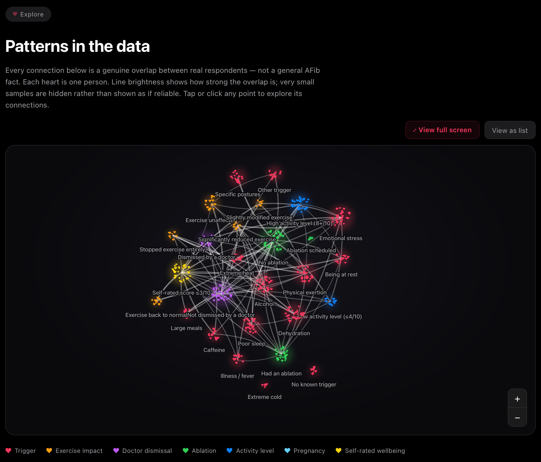
What it actually shows
Each cluster you see is a reported experience: a trigger, a change in exercise habits, a dismissal by a doctor, an ablation outcome, a pregnancy impact, a wellbeing score. Zoom in and you’ll see what each cluster is actually made of. Not a statistic. Not a bar segment. Individual heart-shaped points, drifting slightly, each one catching the light a little differently. Every single one of those hearts is a real person’s heart: someone who sat down, thought carefully about their own experience, and answered honestly.
Every single heart in the constellation is a real person’s heart.
The lines connecting them aren’t guesses, and they’re not general AFib facts pulled from a textbook. They’re calculated directly from the real overlap between real respondents. A bright line means a large share of the people who reported one thing also reported the other. Where the sample behind a connection is too small to mean anything, it’s suppressed rather than shown as if it were reliable. I’d rather show you less and have you trust all of it.
Tap or click any cluster and a panel opens showing exactly what that group looks like: how many people, what percentage of the dataset, and its strongest genuine connections to everything else. It’s less like reading a report and more like following a thread through a conversation you didn’t know you were part of until you started pulling on it.
A different way to look at the same data
The dashboard already gives you the summary view: your own results set against the wider dataset, trigger frequencies, exercise impact, all the headline numbers in one place. That’s still the best place to start. The constellation is something to sit with alongside it, the same way you’d wander through a conversation with someone who has the same condition as you and start noticing threads you hadn’t expected.
Some of those threads are already visible in the underlying numbers. 39% of respondents say they stopped or significantly reduced exercise after diagnosis. 30% say they were dismissed by a doctor at some point, and that number is higher for women than men. Around 4 in 10 have had an ablation, and the average satisfaction score among those who have is a respectable 4.1 out of 5. None of that tells the whole story on its own.
This is where you see how these experiences sit next to each other in the same people, not just alongside each other in a list.
Built for how people actually use their phones
Most of you are reading this on a phone, so the whole thing works properly there: pinch to zoom in on a cluster, tap to explore, everything designed to feel native rather than like a chart squeezed onto a small screen.
Have a look
You’ll find it on the Data page, right above the summary stats. Switch between Lone AFib and Structural AFib to see how the patterns shift depending on whether there’s an underlying heart or health condition involved. If you spot something that surprises you, or a connection you think deserves more attention from researchers, that’s exactly the kind of thing I’d love to hear about.
The dataset is still growing, and it only gets more honest with every person who adds their heart to it. If you haven’t taken the survey yet, that’s the single most useful thing you can do to help. Come find your place in the shape.